

This unit covered tone and how it values can be used to describe an object's form and how the light falls on it. These are principles of chiaroscuro that I've been learning before, but nevertheless it was the most fun bunch of exercises so far in The Foundation Degree. Some of the tasks positively surprised me, and I've learned more with each new sheet of paper used.
Circle to ball, shape to form
These tasks asked of me to draw a circle and then turn it into a 3D ball. I've done this before with Styrofoam balls, but this time I had none. I've helped myself with some photo references and with the basic light principles I know:
- light travels in straight lines, it cannot "bend around the corner"
- the line where no light reaches is the darkest one (the occlusion shadow)
- the length and shape of the cast shadow responds to the distance and strength of the light source
- the light tones and the shadow tones on the form are divided by the terminator line, the line where direct light ends
- reflected light lies in the shadow are on the object, but it is never as light as the darkest value of the light tones.

The lesson asked of me to play with different ways to shade. I did some hatching (still not happy with my hand there), some light back and forward motions (my go-to) , and finally with some squiggly line work, which I loved. The end result looks like a ball of wire.

Sketchbook
I've continued in my A5 sketchbook the task one morning before I made a smoothie out of a very ripe banana. The curved oblong shape gives a lot of opportunity to chase cast and form shadows, and I drew it two time on different sides and in different mediums (graphite and crayon)

When I used colours, I got a little bit lost in them and stopped tracking tone. Especially with one as strong as yellow, a colour can overwhelm the eye and distract from tonal values.

Observing Light and shadow
For this exercise I had to use two everyday objects and light them from one side. I drew my curtains down, turned on the Ikea desk lamp and set up the Sriracha and toilet roll still life motive for the following three drawings.
In the first one (left) I've set out to quickly (although it took ~40mins) map out the forms and tonal values in my A4 sketchbook. I've obviously got caught up in the recognizable Flying Goose Sriracha label, and my designer side got the best of me.

I've also started sketching that one around 4 times in total, wildly underestimating the height of the bottle and the width of the roll. In the end I got an inaccurate rendering of a huge bottle and little roll, while in reality, the toilet roll is wider in girth than the bottle.
Live and learn, and so I did - in the second drawing the proportions are more accurate. I've spend a lot more time on this one, sitting in all at least 3 hours with it. I've got into details, but the drawing, as the first one didn't really come alive until I've put in the darkest lines.

I was somewhat happy with it but after photographing it, I now notice all the little things that spoil it somehow: the fussyness of the label, with the type not being clear in the light, the slight tilt of the top, the shadow behind the bottle being too dark. at least one reassuring thing is that I will never bore of drawing things dear to my heart, or at least amusing to me.
Working in reverse
For this drawing I was to keep the motive, but work in reverse, by covering the paper with a mid-tone value. I used charcoal because I've set out for an A3 format for this one. I filled the paper several times with light pressure of a side of the charcoal stick, and smudged it with, well - toilet paper!
Then I used my trusty putty eraser and set out to lift up the lighter planes. I worked over and over until most of them were formed. It absolutely helped here that I was quite familiar with the forms by now. I then started putting in shadow areas and continued lifting up light and shading in until I was happy with the drawing.

I was surprised how much quicker I was in this way, completing the whole drawing in about quarter of the time than the second one. This was probably due to a combination of familiarity, softness of charcoal and this tonal technique. This drawing might be the most effective one, as it took the least time and it had the most character, in my taste.

Although I enjoy drawing outlines and details, it doesn't help with how already fussy I am about drawing, to the point of immobilising perfectionism. Drawing without outlines reminded me of painting, a more freeing and expressive technique for me. What I would change here I perhaps I would start on a motive with precisely this reverse technique, and then get as detailed-oriented as I want. Sometimes a solid form a few reflected light is all that a picture needs. It was also much easier drawing in a larger format at the end
I was introduced to this technique before, but I've only now remembered I used to draw like this as a bored tween in class. I would fill up my little sketchbook sheet in graphite, and then draw a bench and moonlight in eraser, every time.
This lesson reminded me how easier is to look at the tonal values as a complete scale when we observe from the point of mid-tone. It means we skip through the daunting white paper and get straight into shapes as whole. I can’t wait to try this technique in portrait. It would also be interesting as a warm-up if I were to paint on glass in reverse, perhaps? The applications are endless, and with the use of charcoal, whom I am happy to report I get along with now, it could be a quick option.
Addendum
I’ve tried to use these principles when I continued to sketch more complex things in my A4 sketchbook. First I challenged myself with an intricate, shiny candle holder. I’ve mapped out the basic shape of it, the height and how far the arms go, and then went and just jotted down the shadows. It went much easier than if I were to trace in line all the little creases of the object.

I’ve tried the same approach when drawing these gummy bears, only I’ve introduced colour plus its tonal value. It is really true how learning to draw is half learning to see, so even with such a different technique, I’ve still kept the mapping out the light and dark values to describe the shape, instead of outlining them.
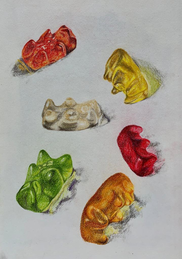
The translucent quality of a gummy bear adds to the reflected highlight of its form. The shadow that it casts first gives way to the light shining through, and then becomes a shadow. I'm keen to test them more with different types of lighting. I never would have guessed my Haribo addiction would lend itself to a good cause!